
Bank of England
The
old lady
Context
The Bank of England is the UK’s central bank and the model on which most modern central banks have been based. Established in 1694 to act as the Government’s banker and debt manager, it is the world’s second oldest central bank. Its mission is to promote the good of the people of the UK by maintaining monetary and financial stability.
Creative challenges
→ Refresh the brand identity to be digital-first
→ Update the visual identity to be accessible and relevant
→ Update the website user interface (UI) to be WCAG (AA) compliant
→ Ideate launch campaigns for the £50 and £20 banknotes
Brand refresh

Symbol
We wanted Britannia to reflect the Bank’s mission and values. We tasked Chris Mitchell at Epic Icons with making the symbol more welcoming and inclusive, and improving its legibility at a small size. The ostentatious pile of coins were removed (the Bank doesn’t issue coins) and the shield was adjusted to include the union flag.
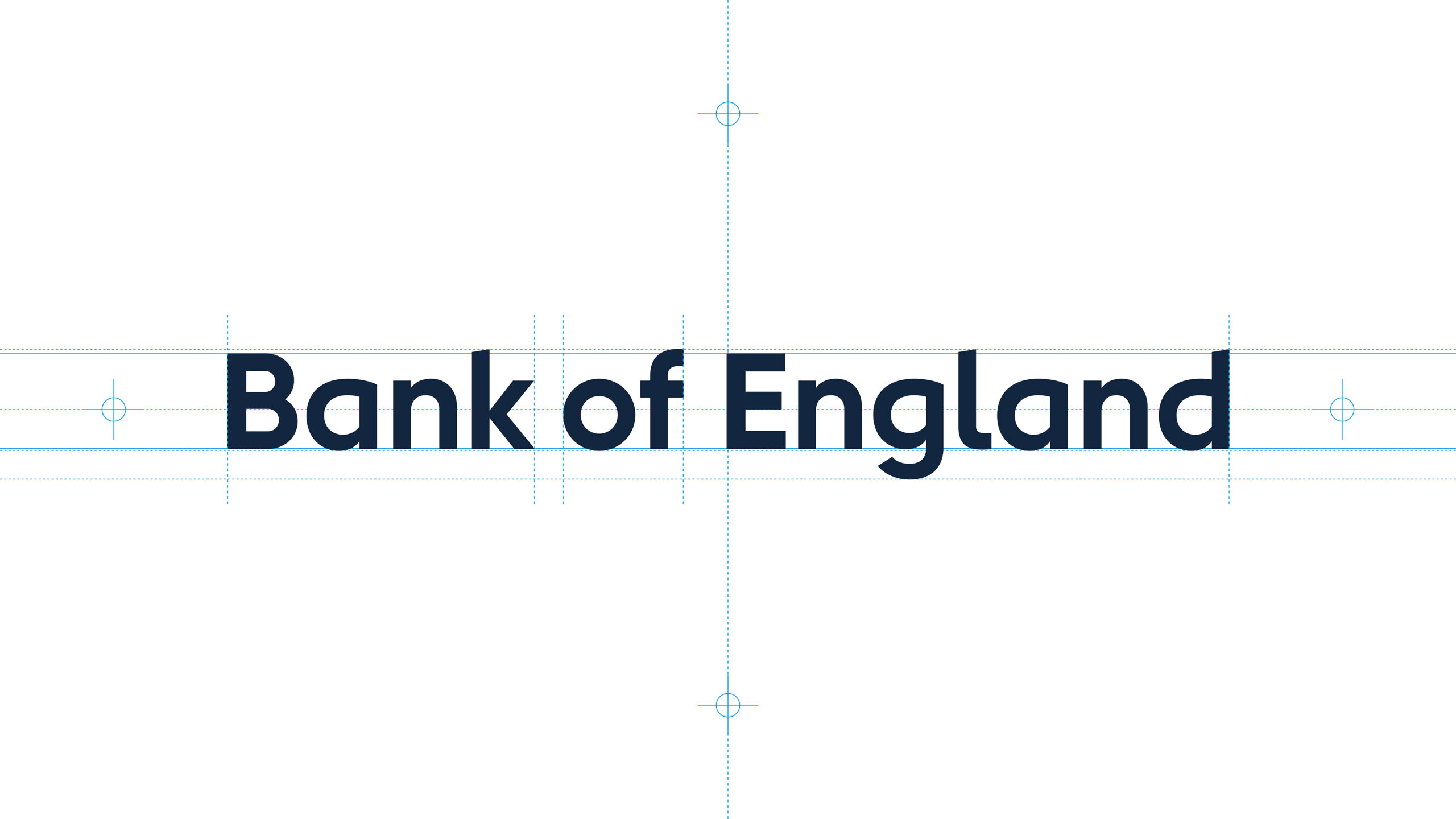
Logotype
The simplified logotype reflects the Bank’s mission to be more approachable, plain (talking) and humble. We dropped previous use of capitals in favour of upper and lowercase letters. We tasked Monotype with adapting an existing font to be more accessible and dyslexia friendly in-line with guidance from the RNIB and the British Dyslexia Association.
Colour
The palette has been designed to be more vibrant and relevant. Inspiration comes from the £5, £10, £20 and £50 banknotes, gold bars, and BOE building. Apart from looking distinctive and memorable, each colour has been selected to be highly accessible making sure the minimum AA rating for Web Content Accessibility Guidelines is achieved.
Photography
We tasked photographer Lee Funnell to apply her mantra ~ make the ubiquitous interesting and the ordinary beautiful ~ to the £5, £10, £20, £50 banknotes.


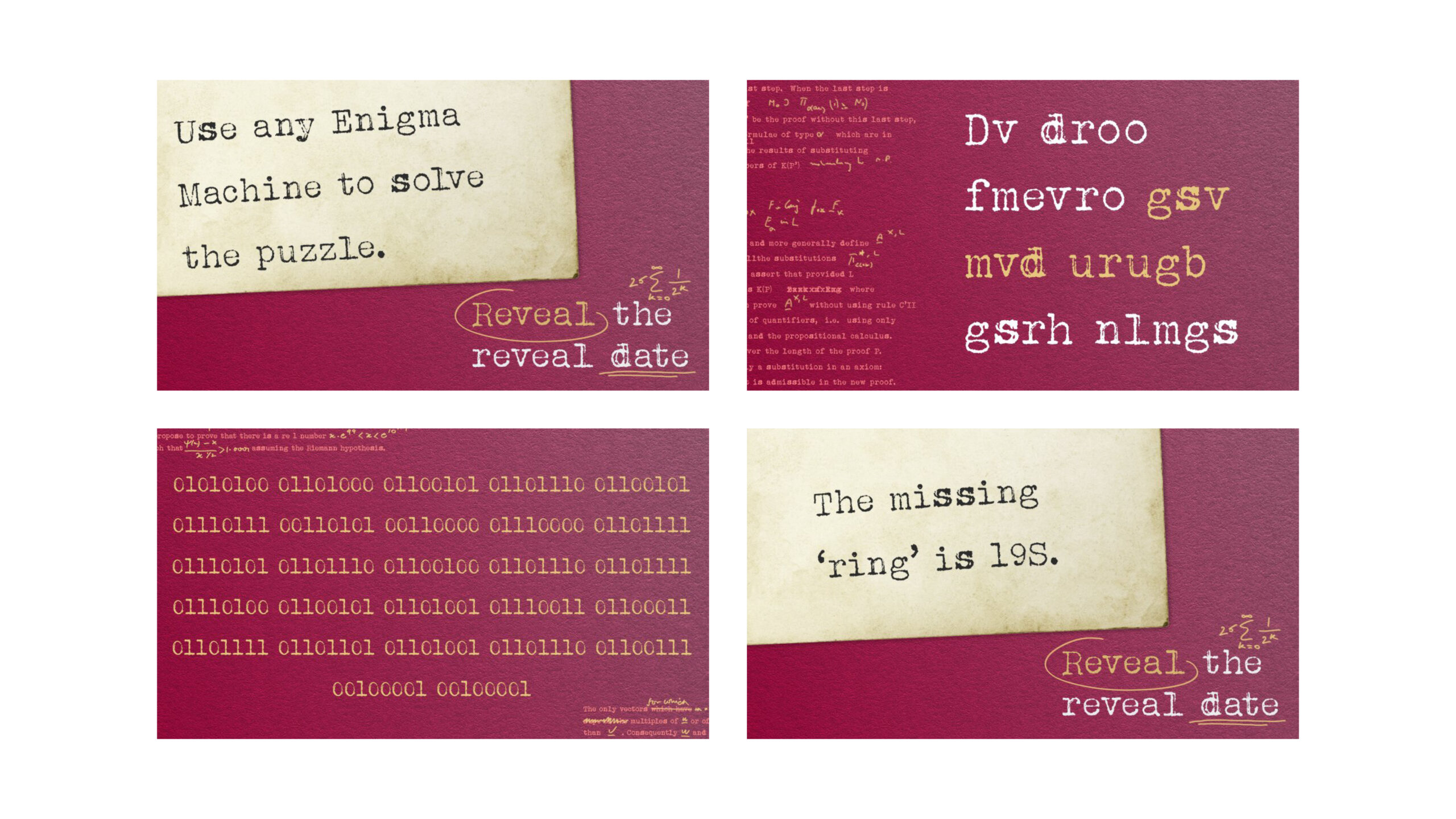
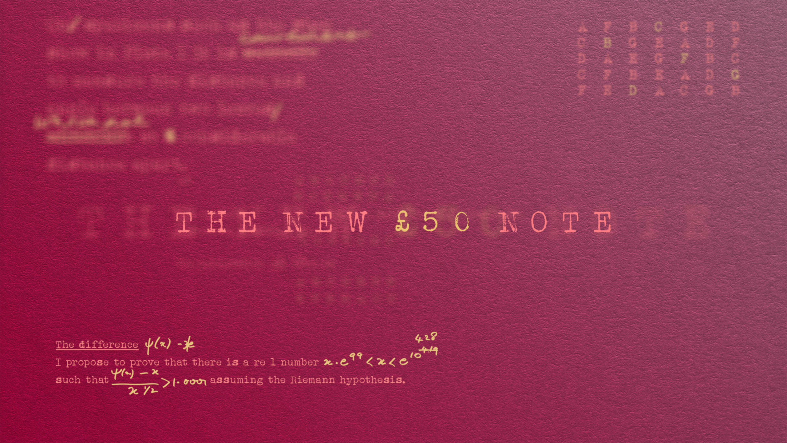
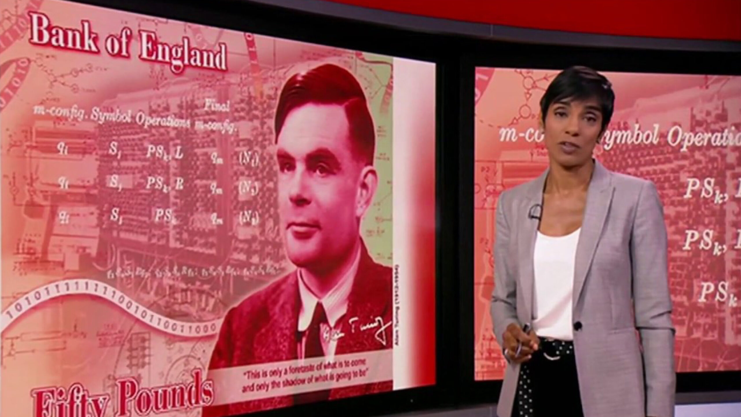
£50 launch campaign
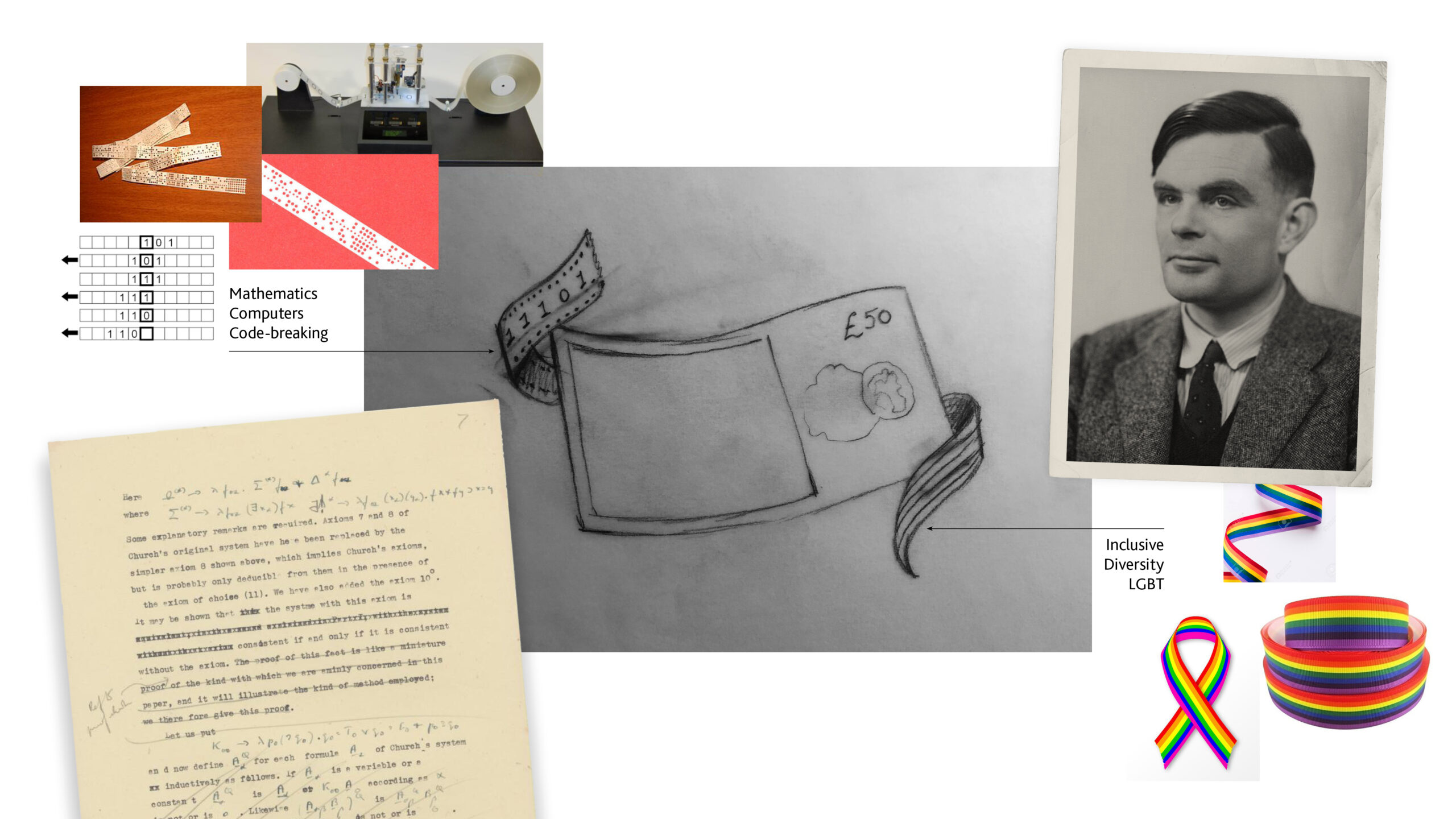
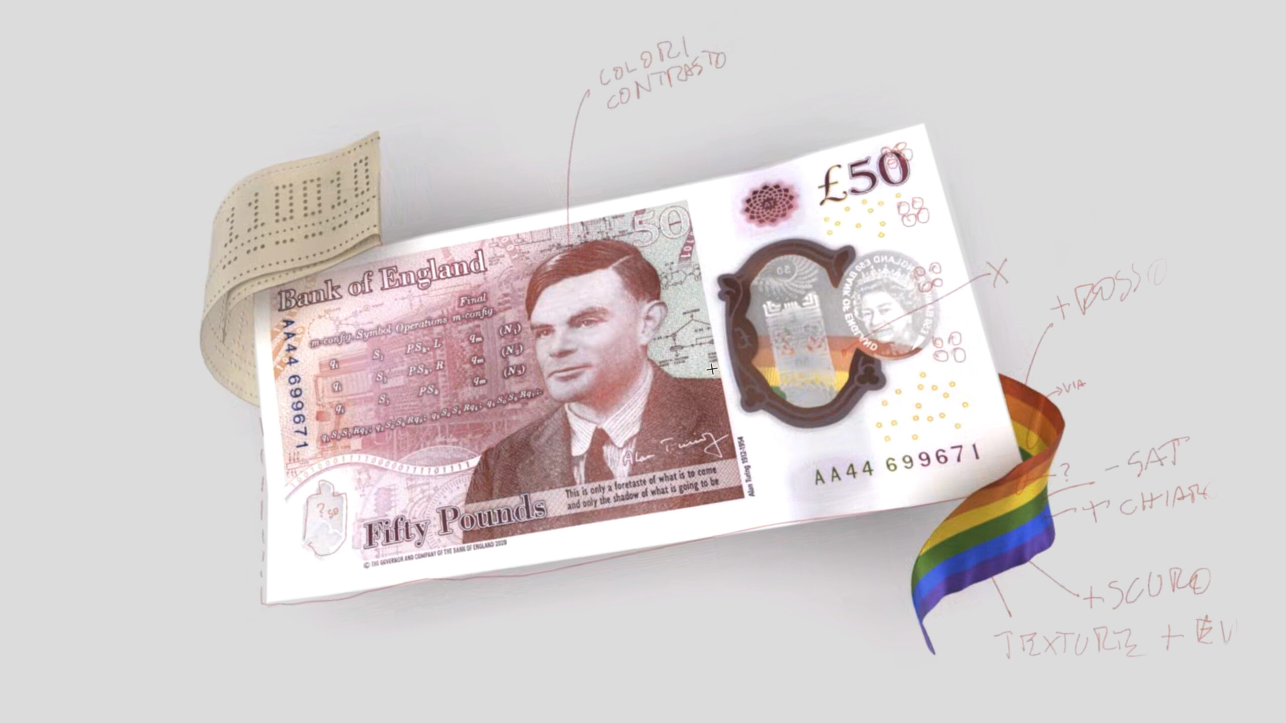
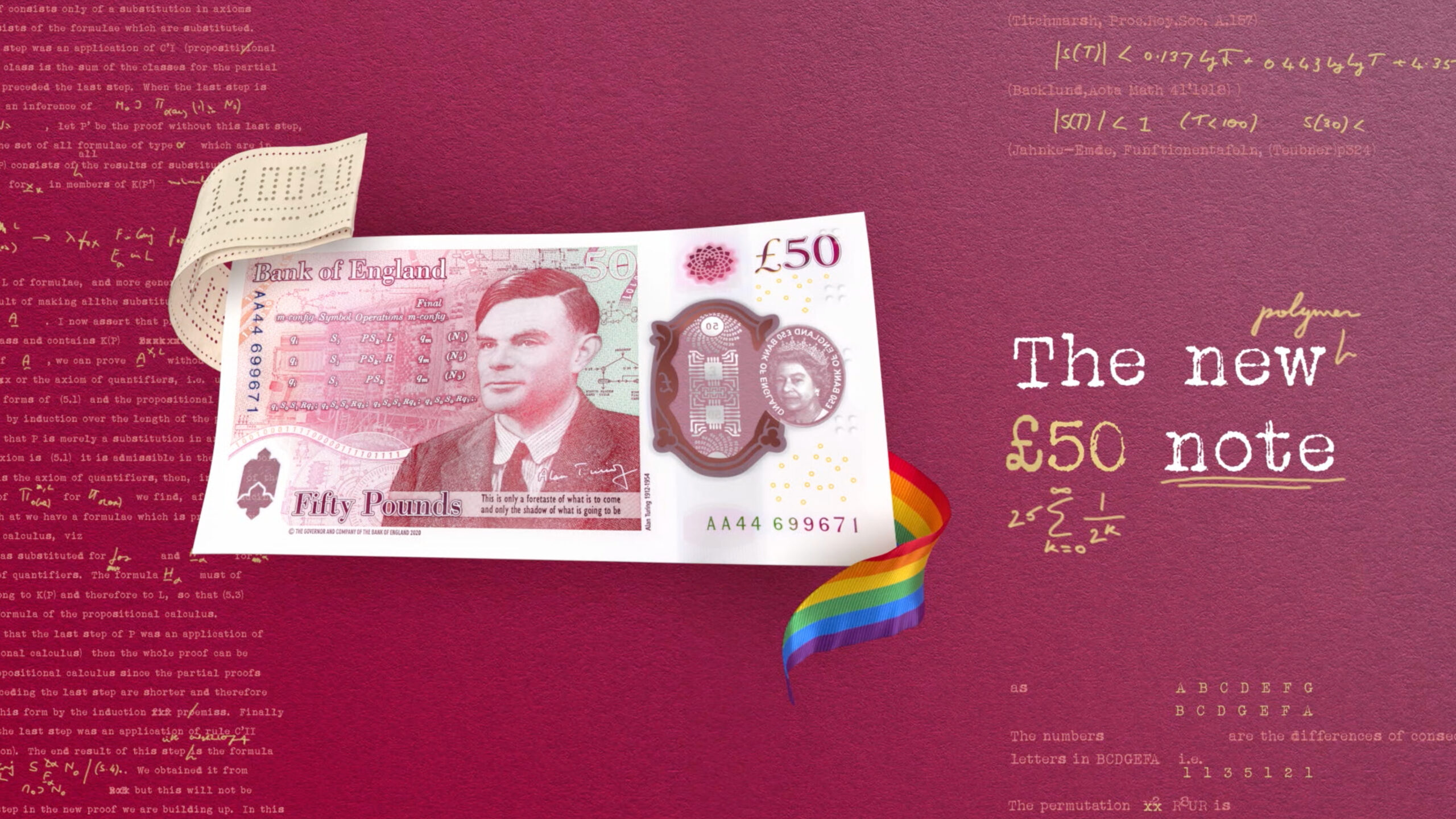
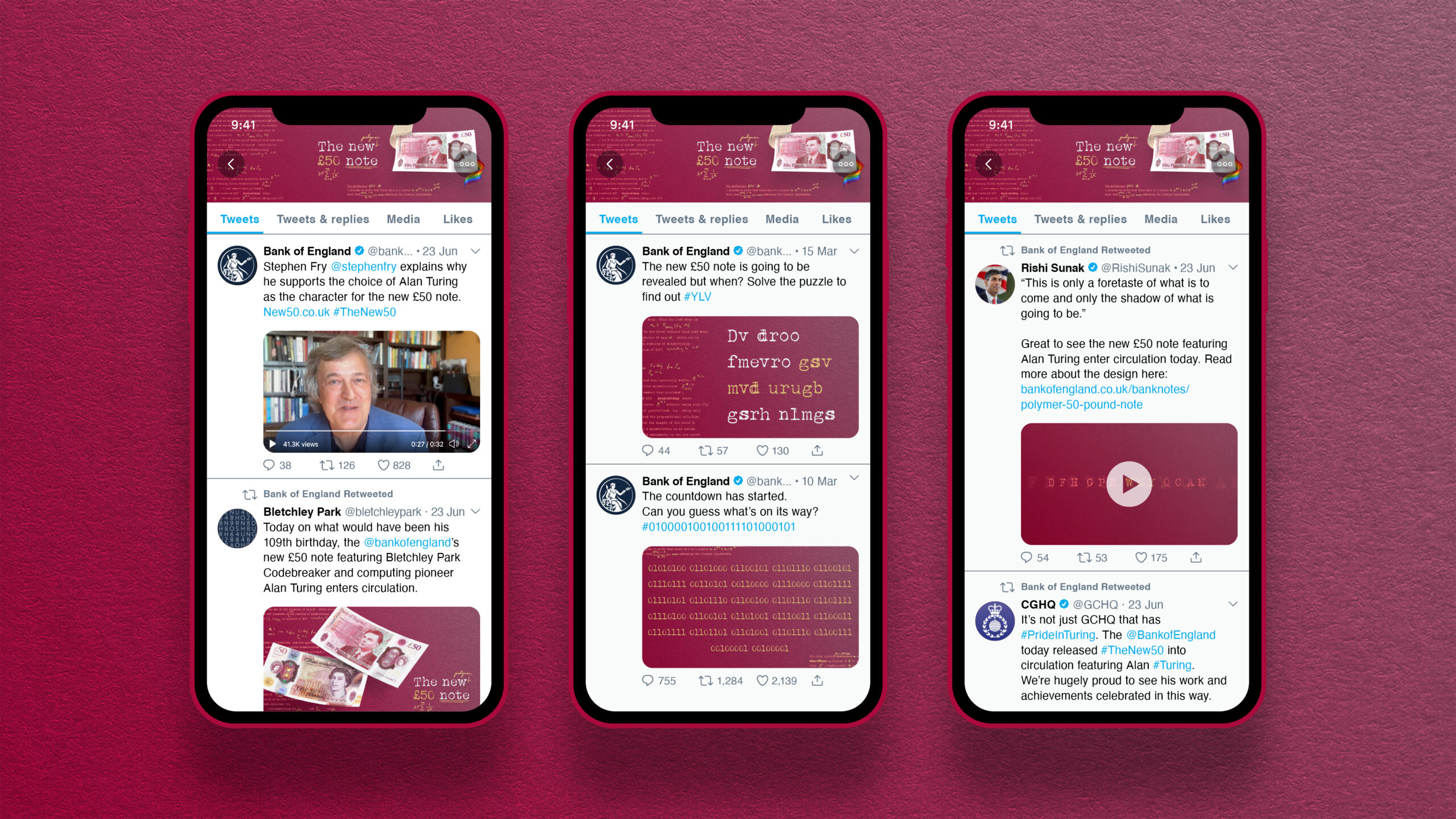
‘People have featured on the reverse of the banknotes since William Shakespeare first appeared on the £20 note in 1970. This allows the Bank to celebrate people who have made an important contribution to UK society and culture through their innovation, leadership, or values.
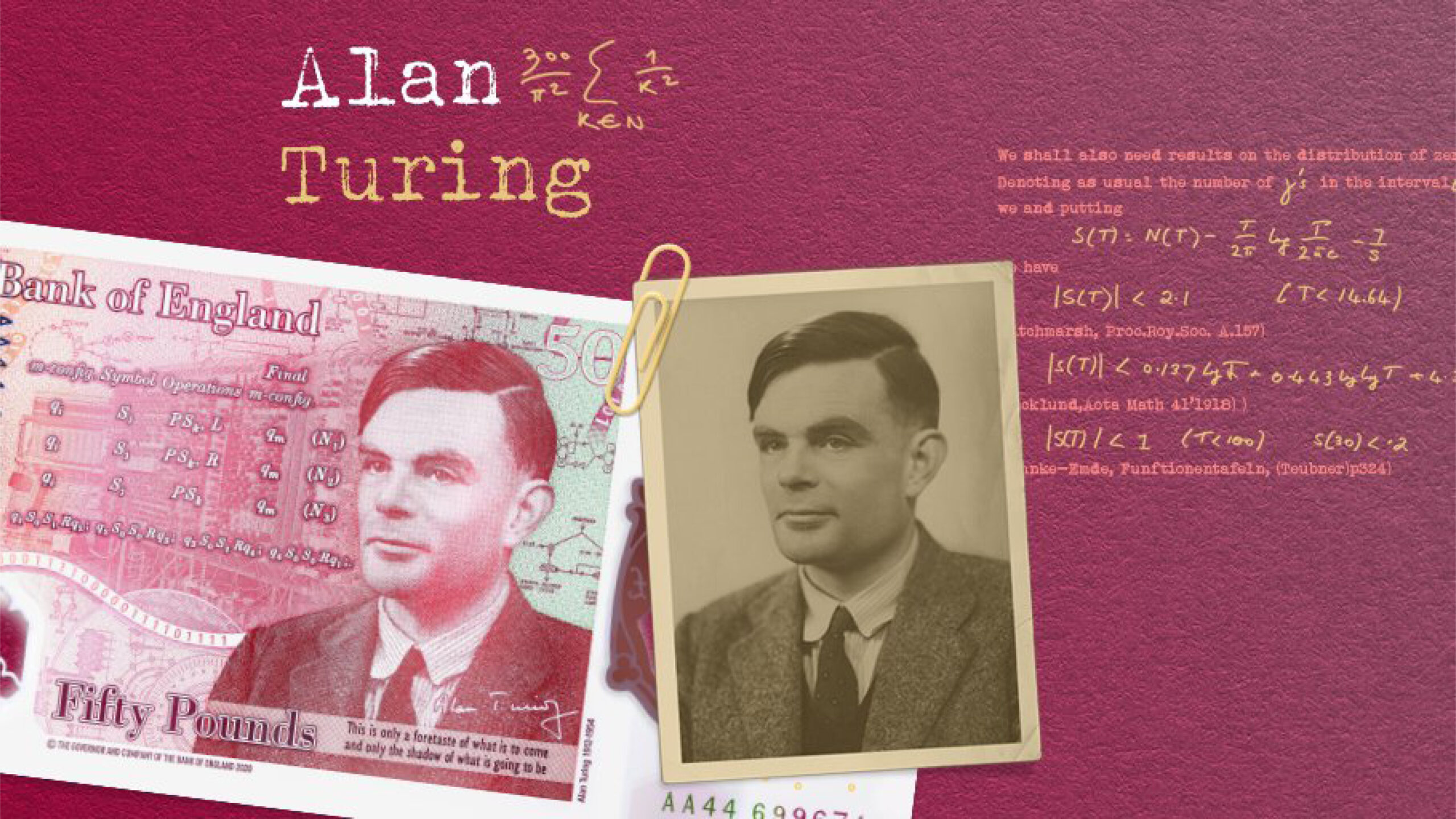
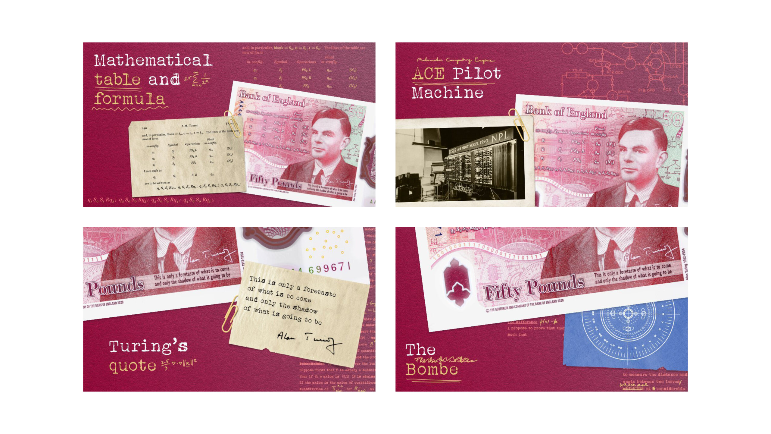
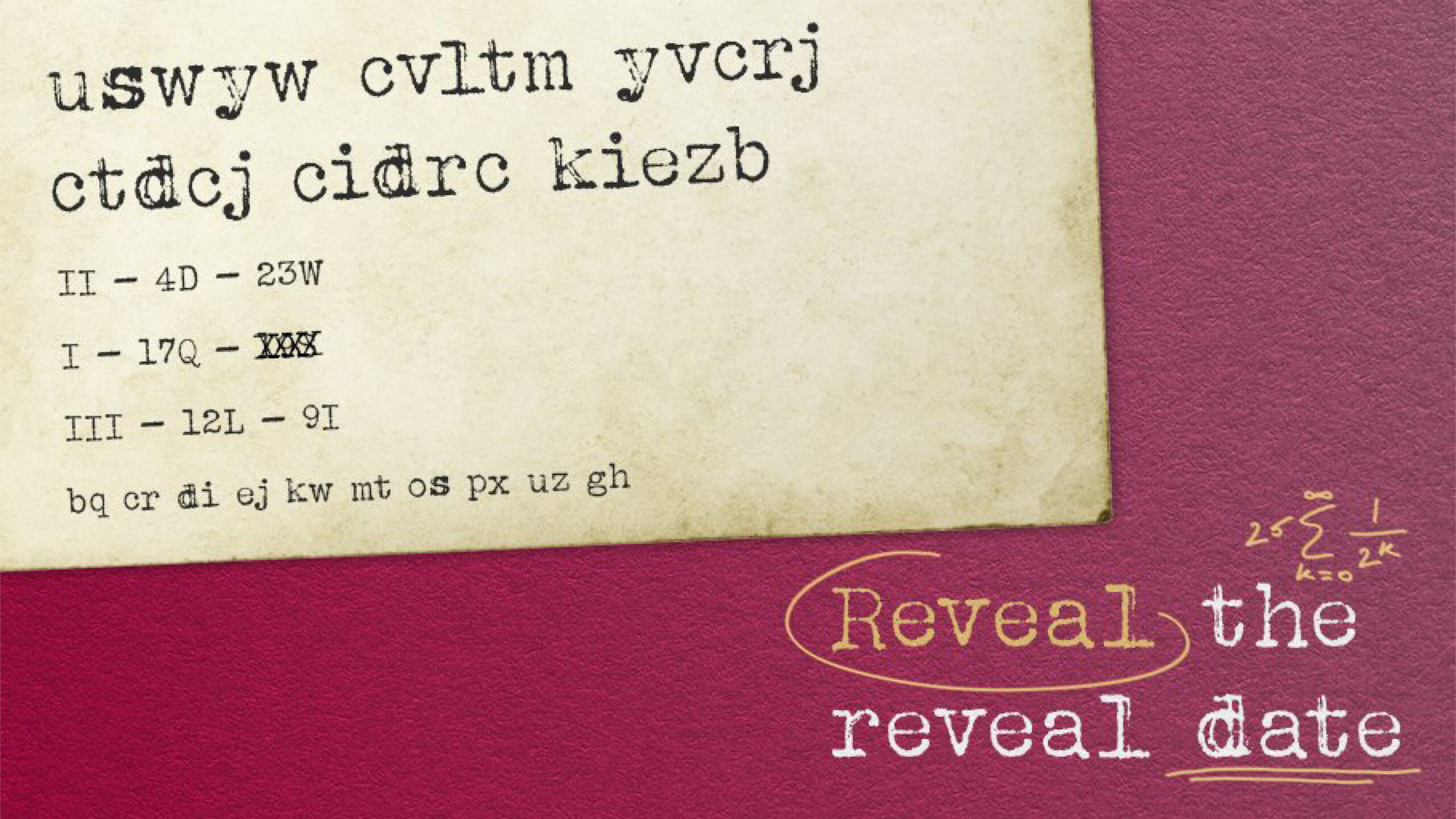
The new £50 features code-breaker and computer science pioneer Alan Turing. It entered circulation on June 23, 2021 (Turing’s birthday) completing the Bank’s transition from paper to polymer banknotes. Shown here as an overview of the visual identity and launch assets which conveyed the creative theme of ‘Turing’s mind at work’.
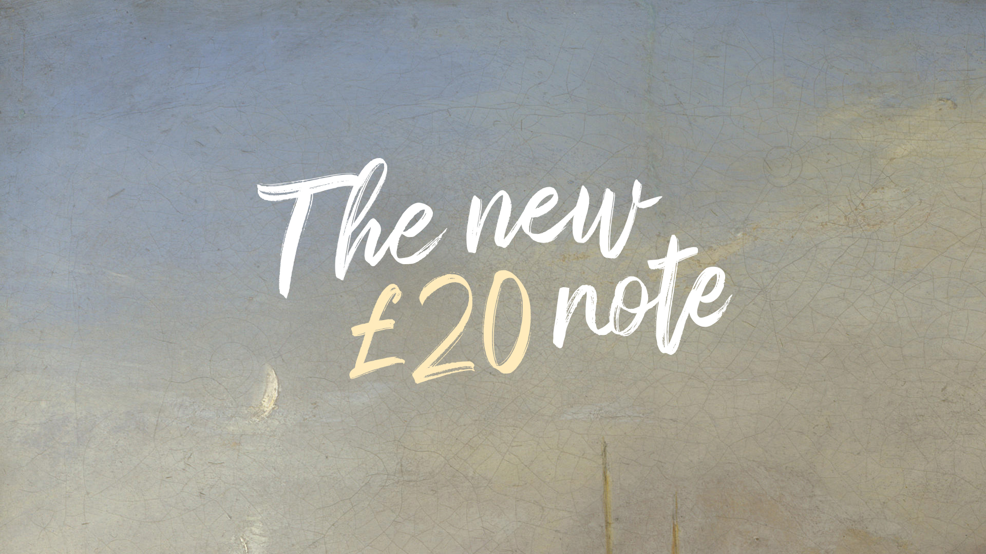
£20 launch campaign
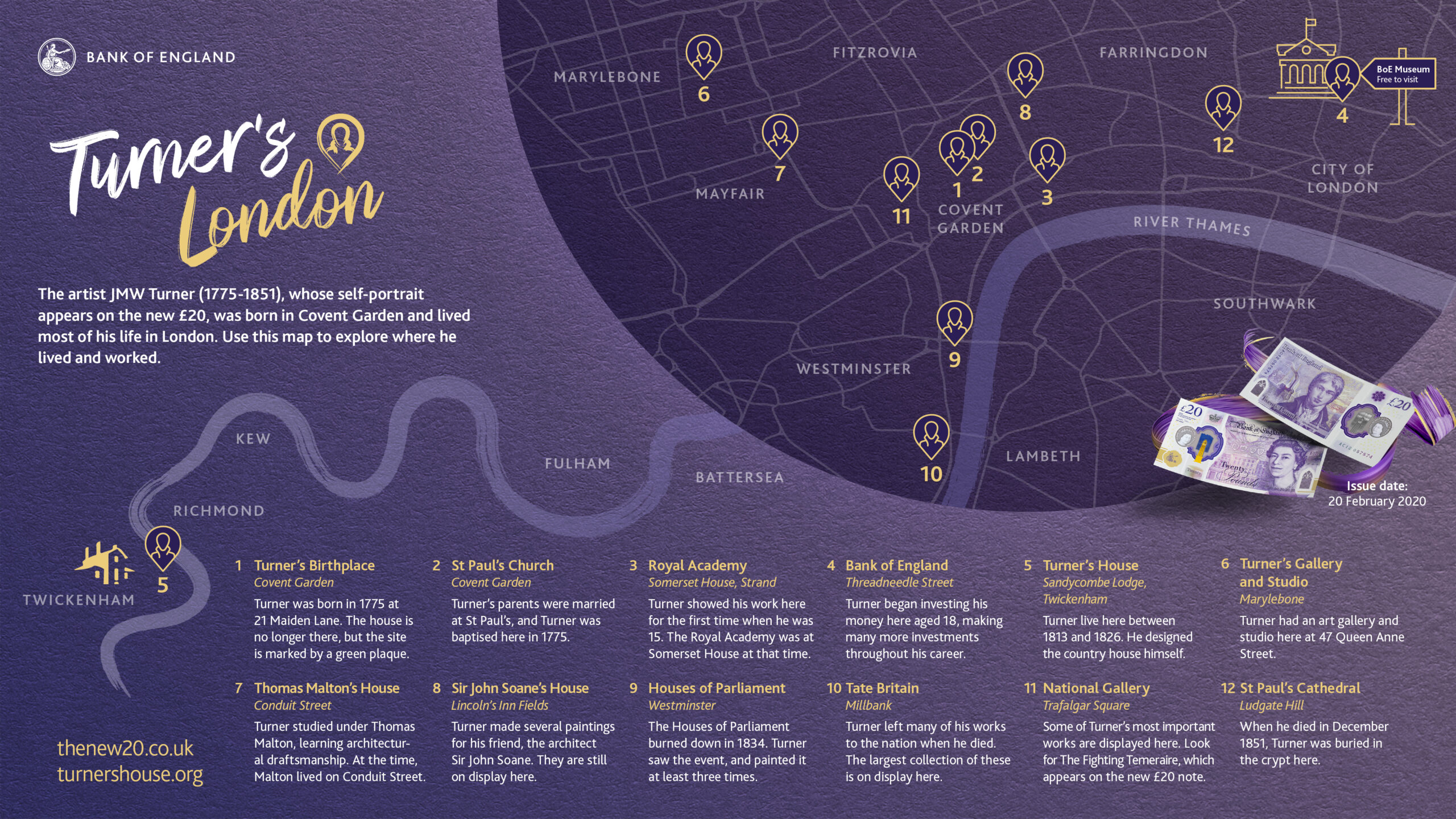
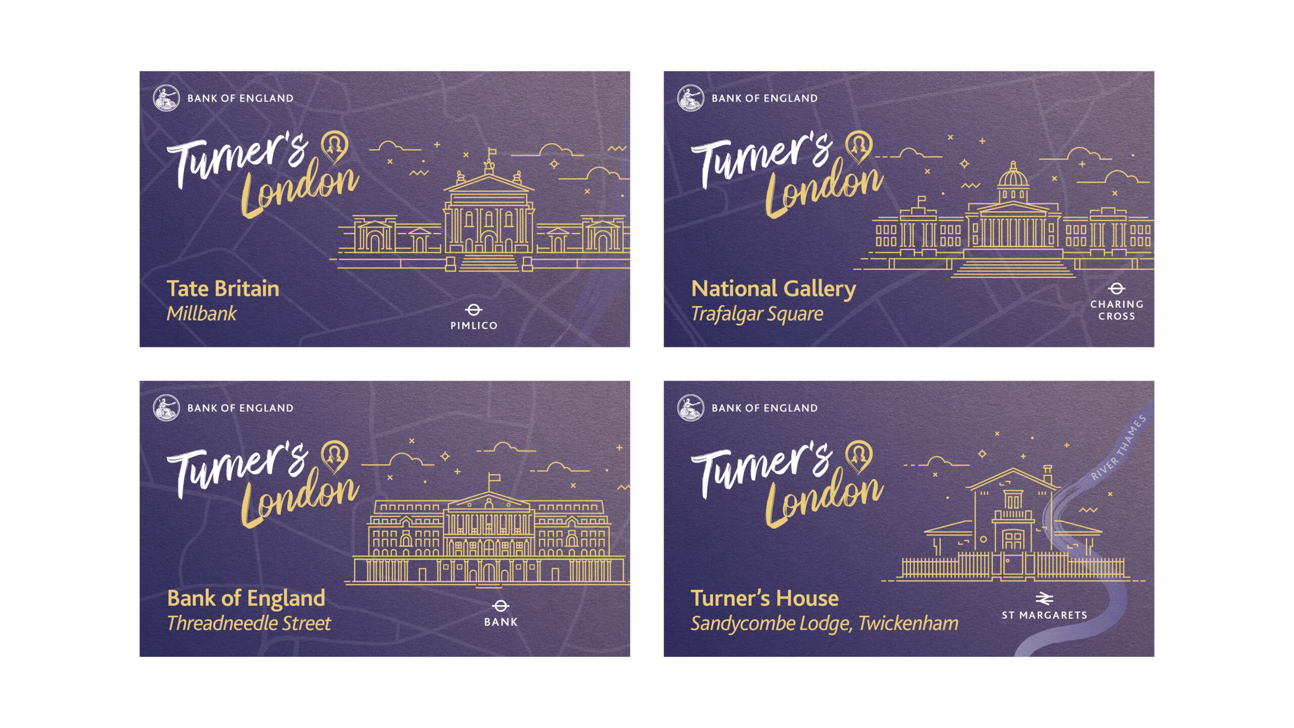
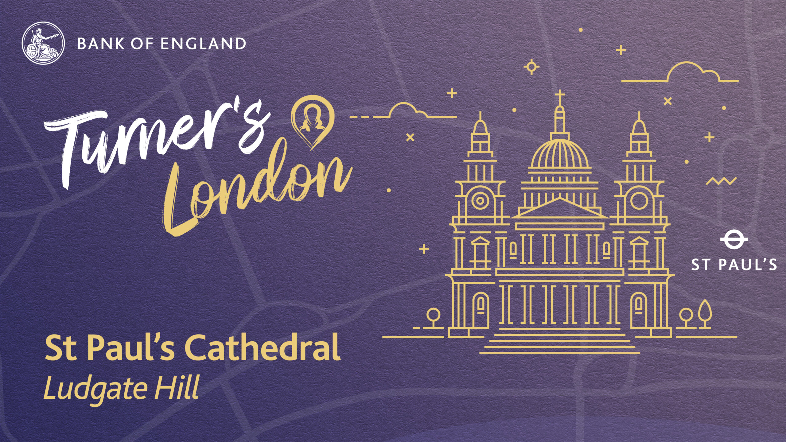

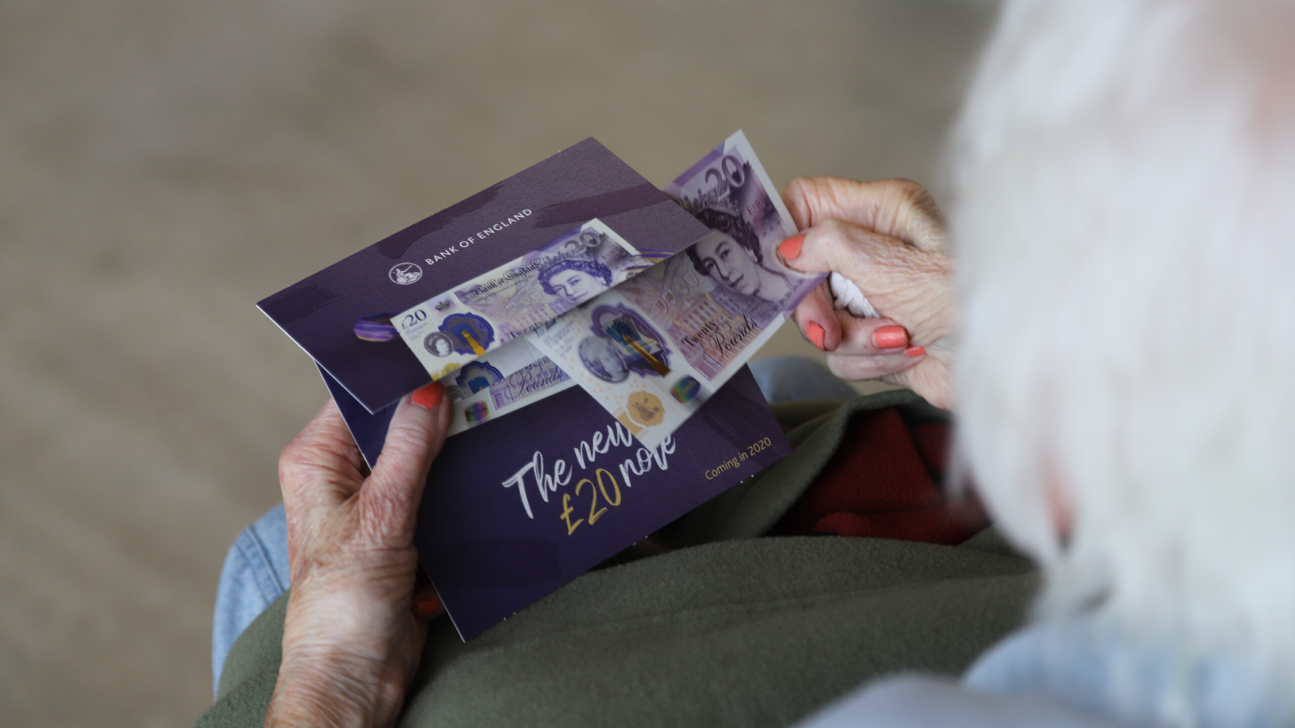
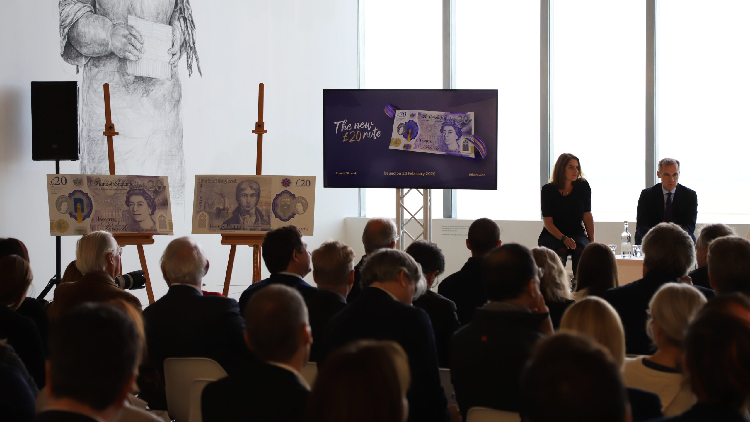

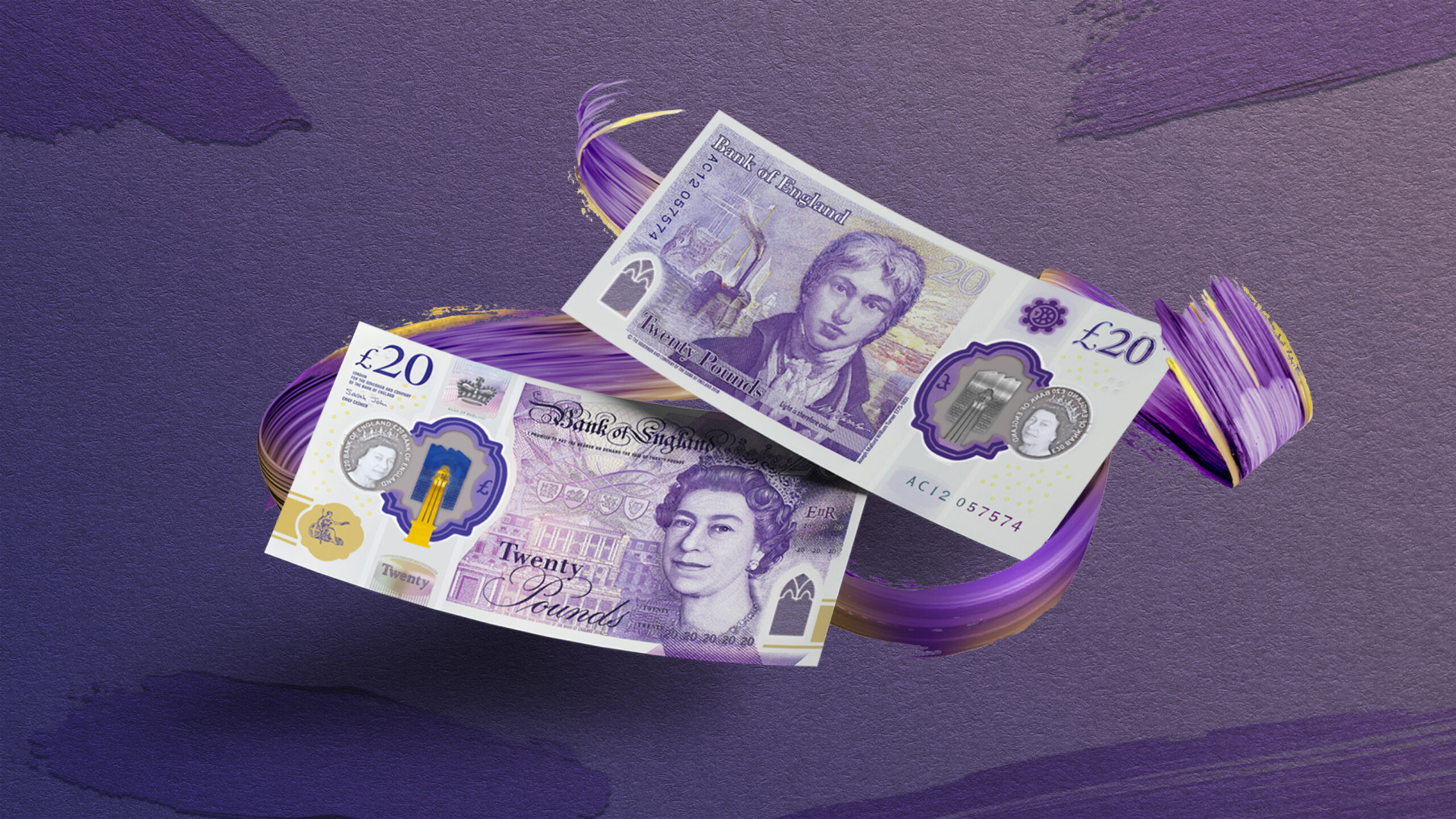
In 2020, the £20 became the UK’s most widely circulated and secure polymer banknote. Then Governor Mark Carney and artist Tracey Emin unveiled the new note at the Turner Contemporary art gallery in Margate. The note features a self-portrait of the artist JMW Turner alongside one of his most famous paintings ‘The Fighting Temeraire’. Shown here is an overview of the visual identity and launch assets which utilised paint brush strokes, paper texture, and hand-drawn typography.
Credits
In-house: Peter McCabe, Matteo Ruisi
Collaborators: BOE Content team, BOE Digital team, BOE Production team, British Dyslexia Association, Lee Funnell, Epic Icons, Monotype, Caroline Preston, RNIB
My role
Art director, Creative director, Designer, Illustrator
Accolades
Winner → The Best Brand Awards
Winner → DNA Design Award
Silver → A’Design Award: Visual Communication
Bronze → A’Design Award: Photography
Andrew Bailey
Governor, Bank of England
“The Bank of England has been around for hundreds of years. But we have just embraced the digital technology of the 21st century. This new era has brought many benefits. One is that it brings us closer to the public we serve. We know this means we better explain what we do and why. How we communicate is part of how we carry out our mission. We intend to keep trying to make our communications more inclusive and accessible for everyone.”